
For this assignment, I created an infographic about Alaska’s disappearing sea ice. I began my research for the infographic assignment by using the provided data set from “Mashable.” However, the data wasn’t very striking or useful, so I looked at a variety of other sources. These included scientific journals, federal and state government websites, and news outlets, to name a few. I eventually found a handful of data points that I liked from three websites:
Data point:
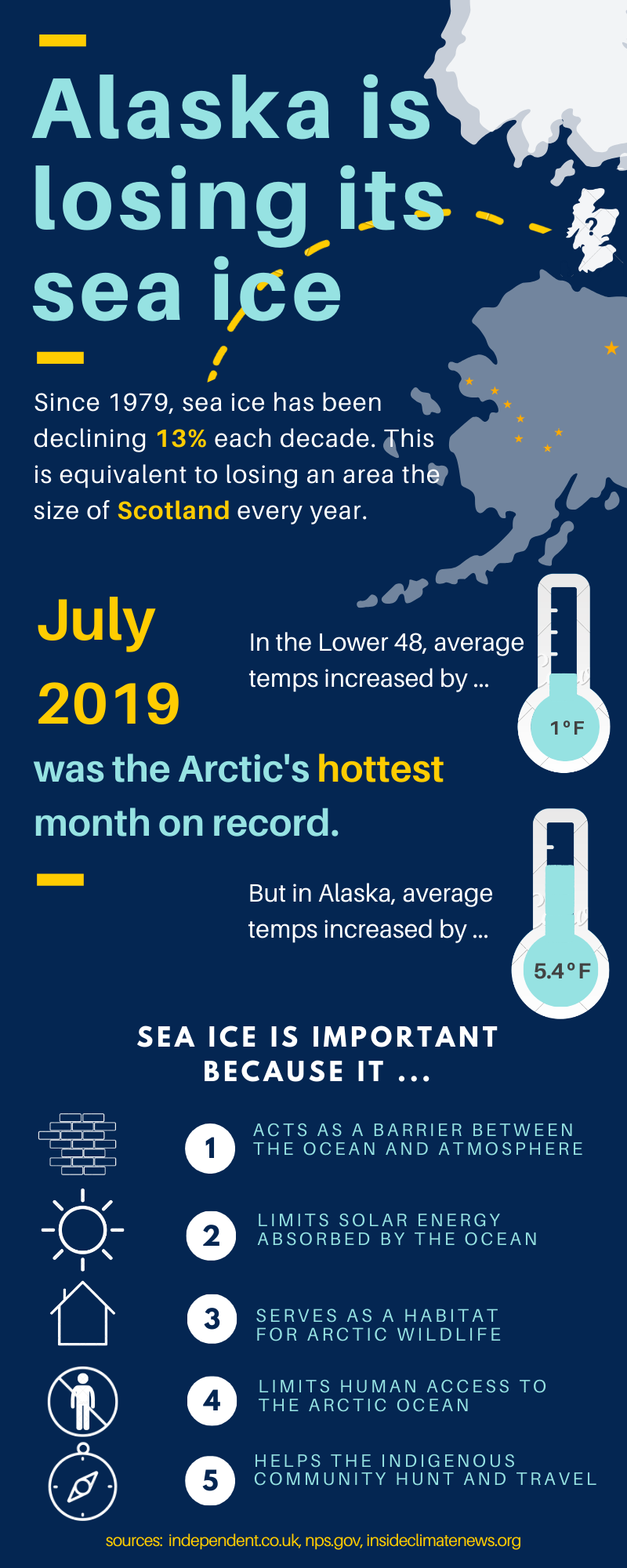
“On average, September sea ice has declined by more than 13 percent per decade over the past 40 years since satellite records began. This is a decline of around 85,000 square km per year — equivalent to losing an area of sea ice each year greater than the size of Scotland.”
Data point:
“Sea ice is an important element of the Arctic system because it (1) acts as a barrier between the underlying ocean and the atmosphere, (2) limits the amount of absorbed solar energy during the summer due to its high albedo, (3) provides a habitat for biological activity, (4) limits human access to the Arctic Ocean, and (5) serves as a platform for Indigenous community hunting and travel.”
Data point:
“Alaska just recorded its warmest July—and warmest month … At a time when the Lower 48 states were clocking average temperatures 1°F above normal, Alaska’s temperatures were 5.4°F above average and 0.8°F more than the previous warmest month, which was July 2004.”
I chose these data points because out of all the data sets I looked at, these were the most visually compelling points to share. Not to mention, the numbers in the first and third data points are quite alarming and immediately stand out.
Color
When designing my infographic, I first picked out my color scheme. I wanted my colors to reflect the main point of my infographic. Alaska is losing its sea ice to global warming and I wanted to point out 1) the alarming degree to which it has disappeared and 2) why it is so important to the Arctic ecosystem. So, I chose white and light blue to reflect the color of sea ice. And I used the navy blue and gold to reflect the colors of Alaska’s state flag. The blue is also fitting for the deep hues of the Arctic Ocean.
Layout and graphics
I wanted my layout to be somewhat chronological. By this I mean that my infographic first presents the problem of sea ice melting and then ends with reasons why sea ice is important. At the top, I created a graphic of sea ice receding from Alaska. Lines lead from the first data point below the title to the gap between the ice and Alaska where I put an image of Scotland (roughly to scale). In the middle, I illustrated my second point by using two thermometers. I placed the temperature increases inside the thermometers and made the traditional red color of the mercury light blue to keep things uniform. In the bottom third of the infographic I illustrated my final data point as a numerical list with small explanatory symbols beside them.
Through my selection of visually compelling data points as well as consideration of color, layout and imagery, I hope that my infographic illustrates the sobering reality of sea ice melt off the coast of Alaska.
